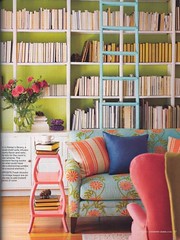
Isn't this a purty, purty place? Lovely colours, that sweet turquoise, delicate embroidery on the sofa fabric, and books....
um, about the books?
WARNING: RANT FOLLOWS!
Didya notice, fellow readers, that the books are SPINE IN??? This image is from the March 2008 Country Home magazine, a magazine I've been buying for years, a magazine I normally respect and enjoy. But holy-moly! It's the second magazine in the last few months (yup, I'll name names, the other one was Elle Decor and I meant to blog that picture too, an apartment in Houston if I remember) to proudly show a collection of books displayed this way.
I hardly know where to start.
Um, why do they have books at all?
Why are their books merely decorative?
How the fangdoodle do they find a book to read, or are these books not about reading, but about having books to show they're nice reading folks, only if you're nice reading folks wouldn't you want to prioritise FINDING the nice books you want to read, not storing them so YOU CAN'T FIND ANYTHING EASILY unless you spent your entire childhood playing memory games like Pelmonism (I think that's what it's called, I spent my childhood, or substantial parts of it, READING).
Lovely room.
Bookcase by the Stupids.
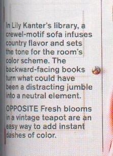
I'll reproduce the description below, because multiple folks have been responsible for not pointing out that this particular Emperor is not only nekkid, but daft as well.
Oh Country Home, you make me weep. And you said it yourself: the backward facing books (backward. Do I need to labour that point? Nope. The readers who read this blog aren't daft) turn what could have been a distracting jumble (both words hugely offensive. Distracting from what? Why is distracting bad? Jumble? Cornucopia, that's what a bookshelf is, a collection of treasures. If you buy a 'jumble' of books, then that's your taste. What, you should just buy books with blue spines or beige ones, so they're decor-books-by-the-yard, irrespective of the WORDS AND STUFF INSIDE THEM?) into a neutral element (neutral. Um, neutered, maybe? simple demonstration of owner cringe? into a laughingstock, maybe....).
From memory, in the Houston apartment in Elle Decor (designed by a son for his mother, but who made the book-organising choice I don't recollect), the decision to put the books spine-in was partly influenced by the fact that they were all dirt-common bestsellery stuff - implication, in this posh noice apartment, they were ashamed of their reading tastes so preferred the calm cream of the page-ends to, omigosh, revealing the titles/authors and their common tastes in reading. Well heck, then put your bookcases in a private room in your apartment, not the living room. Surely any booklover who comes into your parlour will pull out a book or two and instantly know that you're a reader with your own tastes. If they don't share yours, tough luck. They can read what they like.
(I'm steaming, can you tell?????)
Now if only every library in the world adopted this fabulous idea for neatness and design style, wouldn't that be grand? Bit tricky to bung on the spine labels, of course, and it might drive the patrons NUTS...
...and I wonder why there are NO BOOKSHOPS with this display idea?
Incomprehensible.
I are boggled like whoa and damn.
(Just in case you wondered, the fourteen bookshelves scattered through this house all subscribe to the wonderfully old fashioned and incredibly messy idea of having the spines on display, the spines being part of the browsing wonder of the books. Retro, but, um, NOT STUPID?!)
Country Home, I have loved so many of the rooms and ideas and houses you've included over the many years I've been reading. But omigosh.... couldn't someone, at some stage in the editorial process that resulted in this page, have spoken up about this?


8 comments:
ROFLOL! That has got to be the STUPIDEST magazine picture EVER! Isn't one of the joys of visiting friends scanning their bookshelves for shared interests and new books that you might have to borrow?
Every available wall in my house has bookshelves. And that's not even taking into account the great teetering piles of books and other reading material which I have been know to vacuum around.... and oddly enough, all the spines are facing OUTWARDS , too!
Don't suppose this is a good time to tell you about the Teacher-Librarian of a school where I once worked? She told me quite proudly that she only purchased books of one particular size in the non fiction area so that the shelves would always look neat and orderly!
True dinks!
C
I wonder why they bothered with the books at all. Surely a textured wallpaper in a suitably neutral tone would have served their purpose better and it would certainly mean less dusting.
Completely stupid idea - couldn't agree with you more.
I am in total agreement with you on this! If one really must have a neutral bookcase then for heavens sake put the books in bland beige book jackets. sheesh, backwards books, how utterly unbelievable and stupid!
Urgh - I remember the Elle Decor picture and being perturbed by it.
Maybe the next big thing will be buying books by the metre like you used to be able to in the 70s - chosing the spine colours of the (unprinted) books to match your decor...
Oh my god, you have made me laugh. I have seen those kinds of pictures. I myself have several thousand books and I love the distracting jumble of the spines. I had the exact same reaction to those idiots.
You know almost nobody reads anymore don't you? So for them they probably would be distracting. Obviously the decorators are not readers.
With you all the way on this one, Ruth - "distracting jumble" indeed. What planet are these folk on with this particular article!(Never mind whoever thought that this was a clever way to "decorate" a room.) Yes, I have to admit that our totally distracting jumble doesn't even make it to the overstuffed bookcases most of the time! By the way, thoroughly enjoyed your 100 word fiction - thank you.
ROTFLOL ... at first I thought maybe it was a mistake by some retard who set up the picture, that was not noticed by an even bigger retard who put the article together ... or maybe they had to put the books that way so the titles don't advertise books that they did not publish or something ...
but then I noticed the fact that they had actually written about the fact the books were spine in and given an excuse - lol
so I got to thinking ... WHY would someone thing that was a good thing?
hmmmm ...
maybe they DID have to not show the titles/etc of the books, and then one brain cell said to the other one that maybe a reader might notice and wonder if they were stupid - so maybe they had better write an excuse in the article - so they got their genius writer to come up with the "clever" excuse that the books were spine in so they looked better ...
or
maybe the writer actually DID have more than 5 brain cells and when the boss told them the books had to face spine in, they were so peeved that they wrote the stupid article on purpose, so that people would write in and complain and the writer could show the boss and say "told you so"
or maybe they just write any old junk in the articles because the magazine is all about making money from the adverts in them, and they "know" that their readers only look at the pictures anyway ...
My guess is that whoever is responsible for that stupid article and the books facing INwards has probably never read a book in their life and has the attention span of a gnat!
hmmmm ... what a great way to hid the fact that one has way to huge a stash of fabric/yarn/whatever else you collect too much of - put bookcases (nice deep ones) on every wall of the house, put all you stuff in boxes that fit neatly in the shelves and then print out a whole pile of pictures of shelves full of books (spine in or out - whatever floats your boat) and stick the pictures on the boxes - so it looks like you are really intellectual and collect a lot of books ... when in reality you are a pack rat with a nice safe place to hide your stash!
Andrea
(running away before someone whacks me on the head with a book ... which would hurt whicever way the spine was facing)
Post a Comment